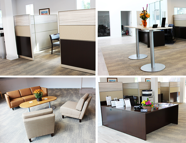

Every now and then we like to acknowledge some of our favorite projects of the year. One of the most notable furniture installations of 2017 was done at Signature Bank’s 7292 W. Devon Ave location, and we attribute its success to many factors.
A Neutral Color Palette
Muted tones of yellow, brown and tan were used in this project, giving an overall air of sophistication. Cubicles were accented with white marble-looking slabs, also utilizing neutral tones. One of the biggest myths of furniture design is that bolder is better. As shown above, neutral colors don’t have to be boring. Quite the opposite! In fact, a calm neutral backdrop can bring out the very best in your design.
An Open Floor Plan
If you look at Signature Bank's floor plan, you will discover that it’s fairly open. There is a clear path without clutter. You may also note the use of natural light. Rule of thumb: Capitalizing on open space and any natural light always makes a space look more inviting.
Choice Furniture Selection
As any good furniture designer would tell you, half the battle to creating an awesome workspace is based on the furniture you choose. With Signature Bank’s installation, the furniture came from our partner HON Company. HON Company prides itself on making furniture that is timeless. The end results are products that never go out of style!


